Possible solutions for Partially Blinded

Foundation Graphics Final Major Project

28/05/2010


I have made some goggles so that the wearer would experience being visually impaired and hopefully will make the viewer experience the products fully when wearing them. I hairsprayed on pair with many layers to achieve the blurry vision look and the other I spray everything black except the middle to get the tunnel vision look.

23/05/2010


For the Perrier bottle I had thought about putting the device so it wraps around the bottle or integrate it into the label somehow... but this wouldn't had worked because the device was flat and it would look like a tangent coming off the bottle. Then a label hanging off the bottle neck was suggested to me and I began to play with that idea. I had initially made the label into a rectangle shaped label and thought it was quite bulky and had to locate the black circle in the centre... and so I gradually began to tear some of the material away and began to hand sew around the device... this gave an odd Q shape which i was happy with compared to the bulky rectangle. The shape also allowed me to hodl it firmly in myhand and push down the button as I wish.
I didn't know how I would secure the label onto the bottle neck and thought of an adjustable strap? Or glueing it on? I then thought of using an elastic band to tie it on which was simple, cheap and would mean the label could be reusable. I brailled the letter P on the button to represent the work "push". I derived this idea after looking at the stop signs for when you push when on the bus... the letter S was brailled onto the button and so I assumed it represented the word Stop.

I've also decided to use an Ariel tablet box because of the shape and how easily I can hide the device. I remembered from the 3D workshop that Neal had switched over the button which activates the recording option to the switch bit which allows the speaker to speak. This allowed the device to have a button instead of a switch and can neatly sit anywhere.

I tried soldering this at home but it was very unsuccessful... I did get the button to work but only when I held the wires down... I think my soldering was either wrong or very wrong. I could get it working but only when I forcefully had everything in place with my hands at work... so in the end I ended up applying the can lids structure into the Ariel box where a button is pushed down. I need to cover up the inside because I had to tape everything in place so it was secure.

22/05/2010


I finally found a lid!

In Morrisons I found some lids used for cat food tins but when I put the device in there was a slight bump caused by the size. This frustrated me and I was tempted to just leave it like that. However I thought of the idea to double up the lids and make the device double insulated which allowed more room in between and plus I do not have to worry about the can being short circuited by the tin. This also allows the lid to be easily removed without the worry of the circuit board collapsing. I can then glue the lids together and than hopefully becomes successful. I had to do some test drill holes to see the size, the texture that gets create and how everything will be placed. After a few tries I proceeded to the real thing!


I decided not to glue the two lids together because I can imagine some dodgy shape as the result and some glue being visible... So I decided to tape it together carefully and unoticeably and this made a more secure smooth finish. For the switch I had coloured a piece of plastic and cut it to shape and then glue it to the device and when pushed and held down, sound is emitted.


I had to drill a larger hole for the speaker's "bum" to rest into in order to make more room for the device to sit inside properly.


I'm very happy with the lids and think it was much better than the shoe polish container because it is now less bulky and securely tight on the cans which if otherwise could have caused some serious damage, both to the producs and user. ALso if I was to make the shoe polish container to stick on the can magnetically, then this could have risked the device to be short circuited and would be a useless device.

21/05/2010


I have inserted the sound system into the dvd's and did come across some difficulties because I had short circuited the Kill Bill one so had to rush to Clintons to get some more cards.. which were double the price I payed on Ebay! Anyway I wanted to also colour the white tabs that tiggered the device to activate black, so used a pernament marker. Little did I know that this somehow affected the tigger and it wouldn't activate it. It took me a while to figure that out and then when I did I managed to find some tabs that I had thrown away because I thought it was no use. After changing it over I used black tape to stick it down and carefully placed everything in line. Another problem that came was that when I opened up the dvd it would speak with a chance of 50/50... this was because the tab wasnt fully or freely being pushed into place for it to be activated and ready when opened. So I had glued on a little notch which will push the tab back into place making the sound system to be activated everytime when opened so I wouldn't worry about it. I'm not sure whether to hide the device with a blank card, but I quite like allowing the viewer to see the device system and how it was constructed. Something to think about I guess

20/05/2010

I had went to the 3D workshop today to ask how I could cut down the wires in the device. Neal was very helpful and had cut down half of the size where I would only use the speaker and the circuit board. He also said that I could use the white disc which was the microphone, and swap it to make it like a speaker because speakers and microphones are practically the same but do different things when we need it to be. We did swap it over but the sound wasnt as loud and clear as the original speaker. I wanted to swap the speaker and microphone because the microphone is smaller and flatter than the speaker and can improve the product significantly, unfortunately in this case it wasn't working for me.

This was great because the shoe polish tin that I spray painted earlier was looking very bulky as a product and not stackable friendly. Using a sealable lid like a McVities biscuit lid would work well but I still face the same problem with space. With the reduced circuit board I have reduced this problem but not enough... but will need to venture out again to find a suitable lid or something.

19/05/2010

A friend of mine today thanked me for a present I had given them for Christmas which was a leather oyster card holder because it became very useful and durable. After the phone call I started to look at my own oyster card holder and I started to think how useful mine had been to me because I carry a variety of cards. I then began to think how I can recognise the different cards because of the colour and how sometimes when I handle cards at work I can guess the type of card the customer is using 80% of the time.

This idea then led to how do partially sighted people differentiate their own cards. And how useful it would be to help them distinguish a card from another like their oyster card against their Master Card. I thought it would be a very useful invention to have an oyster similar to mine.


Here is a basic net of a traditional oyster card holder that I had made out of paper... I thought that there could be braile on the front and the back of the cover saying which card is which.


Inside is where the card would be inserted. However I thought that the idea of implimenting sound into this but it would be way too chunky to integrate it into it... If I had enough time to find a smaller and flatter device then the product could be further developed.

After a few sketches and disgrams of how to make this product work nicely... I decided to actually move away from the oyster card holder frame and thougth that each card could hang off a keyring... this allows the cards to be freely moved around and can easily see each card. Bold cards are a must and braille can be placed. Along with the oyster card I had included Visa and Mastercard, and also a medical card holder since most people may loose their sight due to health problems. I also brought a large keyring and might later attached one of those hook keyrings you find when you absail....


18/05/2010


After looking at the 10 products for the final pieces, I found it hard to imagine how I could integrate sound system into the plaster and cereal boxes. The difficulties would be how would I create a cover for it and print text onto it? Would I create a net and stick it together, woudl I reuse the packaging? Could I reverse the box then print onto it? How would I create a bold background colour on it? So I have decided to scrap the creael and plaster boxes because it would be too difficult to handle with and instead thought of the idea of creating dvd cases for the visually impaired. This idea came across to me because I wanted to keep to the theme of trying to distinguish different genres of the same items (i.e. distinguishing different food contents within each tin) and thought of the idea of a talking book. A talking book would be fascinating but unconvenient because it would very bulky.. and that is how I led to the idea of the dvd cover.


The first film that came to my head when I thought of creating a dvd cover for the partially blind was Kill Bill. The colour theme was a contrasting yellow and black and I thought it would be an obvious and well known link to the film and the text. I constructed the layout of the cover and had to research into what was on the original dvd cover. I've stripped the context down to:

Starring
Director

Writers

Producers

Run Time
and the certificate


I did think about whether to include the description of the film but the original context was quite a paragraph and would of taken up much of the room. I thought it would be interesting to have the credits included though especially the option to know how long the film last for. I also thought the certification was important because what if the visually impaired person was a mother who would want to buy a dvd for their child? They would need to know whether they were old enough and this will remove the dependancy of asking someone if it wasn't available or readable from the cover.

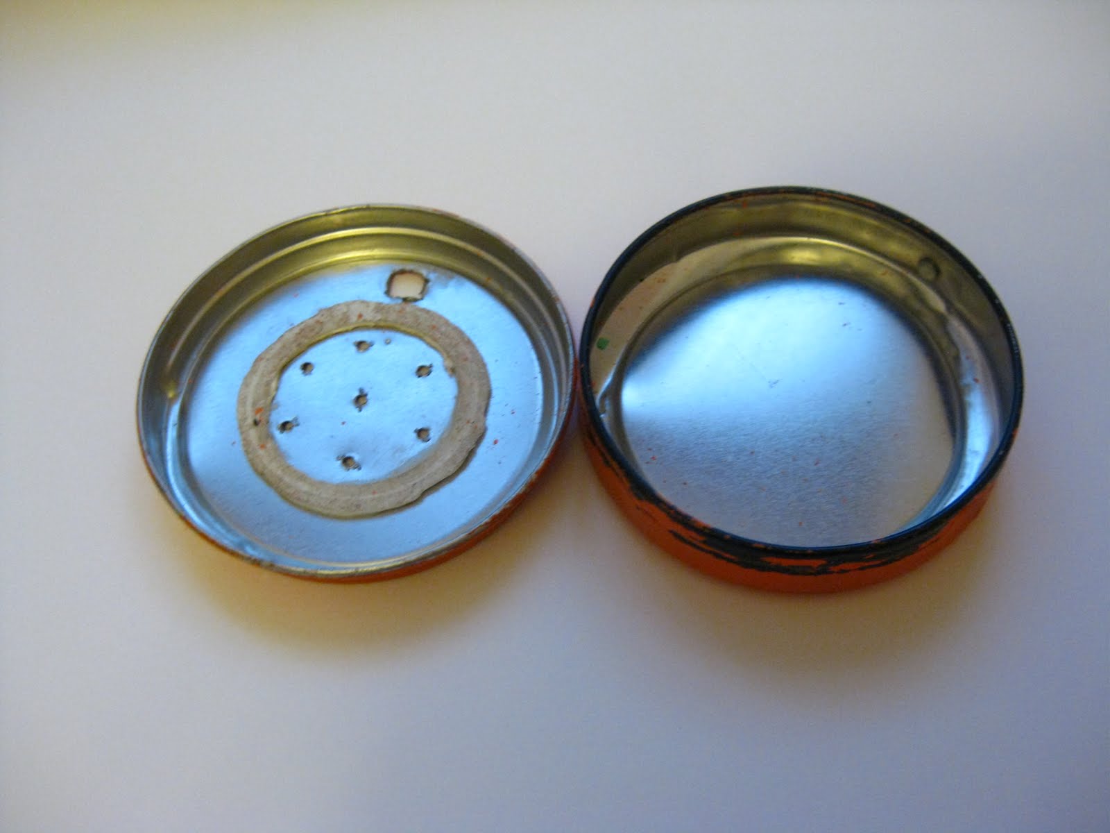
After printing the cover I affixed the braille onto it too for the title on the front and the spine. I then plan to drill some holes similar to the can lid idea and have the button on the front so the user can locate and hold down the button to hear what film they are selecting.

Other films I have thought of extending this to was Batman returns (Black and yellow), Sin City (Black and White), Avatar (Blue and yellow) and Eternal Sunshine of the Spotless Mind (Yellow and Black). I thought that Avatar and Sin City would be a better line up against Kill Bill because of the visual colours when put together.

I tested drilling the holes into the dvd cover and because of the plastic film of the cover, the texture afterwards creates an unpresentable surface that I don't really like. I was thinking of the speaker holes to be laser cut so I went to a laser cutter who explained that the plastic would melt if they did it. I didn't want to hand cut the individual holes myself because I know this will look unprofessional, square like and worse than the drilled holes. I then thought of the card where the devices came from where you would open the card to hear the greeting... I could integrate this into the dvd where the dvd is opened and it speaks. Its a simple solution and avoids the complication of the drilling. It would also make the product look neater too.


17/05/2010

Braille gird


I've created a "braille grid" using the same dimensions as the braille I ordered from the RNIB during my research. From this I can affix my braille text and align it how I want. I am only going to do braille over the title and the quanities of the products beause not all of the brailled ingredients can fit and takes up alot of space.

With the braille I have carefully used a blunt pin and pushed it on the other side of the paper like old style braille technique. This technique has made my hand painful after a while but have plastered up my fingers and worn a glove for protection. I had to try 3 attempts of each design to master the pressure of pushing the pin because I kept punching holes through them all. After a few attempts I have finally successfully made the braille on my 3 tinned cans. I have really liked the way the braille has come out and really think its a beautiful typeface (if i can call it that?). I think it gets easy to learn after constructing the braille together.

16/05/2010


Letterpressing was very unsuccessful with the coloured paper because the ink wouldn't be bright enough to contrast againt it. This became very frustrating as for a product for the blind, an important detail is that the letters are sharp, precise and visibly contrasted against the paper. The only one that had become successful was the black against yellow as this was dark ink on light paper- it did not work the other way round. Travelling home I was thinking of alternative ways to create my text and went into Cass Art for any inspiration. I had thought of letter transfers (but the sizes for too small and it would be hard to create an accurate alignment of the text), stenciling (this would be the same as letter transfers and also the text would have stencil outlinings) and also reconsidered screen printing but this wasn't a successful technique as it wasn't crisp enough. I then considered printing the labels off using a printer- this would enable me to compose the text easily, have a much clearer print and most importantly have a range of colours. Although this is a cost efficient solution I fear that it is a quite boring technique and quite flat.

After printing the labels off a laserjet printer, I felt this solution was much better than the letterpressing and screenprinting because everything was clear, precise and contrasting. I began to think this was the best solution and actually quite like the effect it has, its made the label much clearer and I am able to braille into the paper. Also I was able to create a contrasting background on the title of the cans to make it stand out more and I think it works visually better as there is a main attraction to the eyes. I think it would make locating the name of the label better and faster too. Although I have enjoyed the tecnhiques of letterpressing, I wouldn't have been able to do the contrasting colours very well which is why I will continue to use the printer solution with the rest of my project. Also I was contemplating whether to use/avoid capital letters in my ingredients because the RNIB recommended to avoid using capital letters. To answer my question I called up the MertonVision Centre again asking what to do and the woman kindly advised me to use Arial typeface and type the context exactly how it is and not to change it whatsoever. And so I have done this across my labels and will do for everything else.

With the contrasting background on the main title of the label

13/05/2010


I plan to attempt to create 10 different items as my final products; these 10 could be everyday supermarket items such as breakfast items since I already have baked beans in line. I'm thinking of items such as cornflakes, eggs and maybe toiletries like toothbrush and plasters.

After spray painting the lid yesterday I quite liked the matted even coating the spray paint had given and so I have tested the spray paint on piece of paper. This gave a very smooth finish and the plastic coating that you will find on labels already. I will need to think about whetehr the letterpress ink will absorb into the spray paint and whether it is cost efficient for me as I will need different colours which can become pricey. To save money I could alternate the colours between the cans and lids... but then I would need to think carefully what colours contrast with what and which one becomes suitable.

I did reach to the conclusion that spray painting the labels would be too expensive and that coloured paper would be cheaper. I brought some flourescent colours and ordinary bright colours to see which one would work best. After putting the flourescent pink and green onto the can it did make my eyes strain and could imagine the colours not helping to read the context better, but to damage the eye further. Because of this flourescent colours are a no no and so had run down to Paperchase to buy a pack of coloured paper because the ones I got from the college shop was a bit too thick for my liking. I plan to cut this out in time for letterpress tomorrow to test it out and hopefully my labels will be ready. The last image compares the two labels (orange which was spray painted and the yellow which is yellow paper) and shows which one has the glossy coating. After reading adivce off the RNIB website about how to make clear print they said to avoid glossy paper as this can distract someone's ability to read. So therefore the spray paint is not effective as it is too expensive and creates too much of a gloss.

Also I had brought my 10 items today which were a bottle of lambrusco, bottle of perrier, plasters, toothbrush, 3 tinned cans, cornflakes, fairy liquid bottle and comfort fabric detergent bottle. I had chosen some containers which were similar to each other ins ize and shape because I wanted viewer to realise how one can easily mistaken something because of their sight loss.

I had also thought about how to integrate the sound system into the odd shaped containers like the wine bottle, and a possible solution could be to have an elastic strap connected to the device container and let it wrap round any container where it is flexible and universal. This idea canme across to me after looking over my research where elastic bands are frequently used to distinguish cans between each other and thought it would be nice to try and develop that idea further. However the negavtive sides of the elastic idea is that it might not be stable enoughw hen wrapped round the wine bottle as I can imagine it slipping off and could result to a terrible accident. Might not be safe..

09/05/2010


After thinking about how to integrate sound system into the can, I searched everywhere online for any micro recorders/speakers and they were either out of my budget or didn't have the recording option. I even contemplated taking apart a dictaphone but I think that would be too extreme and very expensive to do. After searching online for different parts, I remembered about the cards where you opened it up and it would make a voice activated greeting and recall seeing ones where you can record your own. After searching on ebay I had found a seller who was selling them so I ordered 1... the following night I had popped down to Tesco's to see if they sold any but was unsuccessful in finding one, but I did find a sealable lid that could stuck on thetop of the lid and where the device can be placed in between. When I got home that night I placed the lid onto the tin and realised there was not enough room for the device to fit inside and would have to extend the lid higher in 3D workshop or find a different solution. The next morning I went to Clinton's to see if they had any recordable cards and had fortunately found one, but for double the price of the one on ebay. I had also found a shoe polish container which looked like it would fit nicely on top of the can. When I got home I had spray painted the container orange for obvious visual purposes and then drilled some holes into the container and when placed together it worked fine. I like this container much better as it gives much room to work with but although it is quite large, I fear that it won't be suitable for stacking purposes. This talking lid is to be left sitting on top of the tin and possibly be magnetic, but am not sure whether it will disrupt the circuit or not but will need to ask someone. I think if this was to be a real product the lid can be purchased either by itself or with the can. To activate the device I will need a plastic piece which pushes down to the circuit and needs to be held down for the recording to be finished.

07/05/2010

Reversible label idea?


Testing out with the reversible label idea I first used the velcro to secure in place. This was good tool because when I reverse the label the velcro it is still hidden away... however the label becomes bulky and it actually makes me feel like I am dressing the tin can like a Barbie doll. It is more prone to wear and tear though seeing the nature of the removal of the label.

I next thought of the idea of using magnets to try and secure it in place, but this did not work as well as the velcro method did because when it was reversed, the positive vs. negative side of the magnets would oppose each other and it didn't work well. Plus I could imagine the magnets sticking to other tin cans which wouldn't be helpful at all.

I've started thinking about how I am going to print the background colour onto the label as I do want a smooth finishing touch to avoid the confusion of texture if I was to put braille on. I have experimented with rolling the colour on but this created a slight testure after the roller... I then tried another type of roller and this result came out slightly better but it still had texture. Also it left a matt texture which I'm not too keen about because it makes the product quite dull and not vibrant. It may be because of the colours I am using to test out because they are quite pastel based... which I am determined to brighten up. Finally I watered down some acrylic and used a brush to paint it on which came out a much smoother texture then the other two however the strokes of the brush came be seen... this may be resolved by using a bigger brush. I can imagine the strokes still being seen and will still not achieve the smooth texture that is desired. I feel looking back at my test pieces just made I need to think of what type of paper to use, colour, medium to paint it with and whether to reuse the label and make it reversible- I am going to discard the idea of reversing the label because I feel it brings no use to the product and project. Also the technique of making it reversible (i.e. using velcro or magnets) will remove sense of the product being a tinned can of food. The removal of the label is already difficult as I am constantly tearing the ends therefore making the attachment of the velcro/magnets impossible almost.

05/05/2010

With the thought of what material I can print the labels onto- whether it be paper, newsprint, glossy paper etc... I really wanted to keep the same texture of what is already on tinned cans. After observing the can and removing the label, I thought of the idea of reusing the label as it is already available to me. If the label is reversible, both visual and visually impaired people are able to read as desired. It will also maintain a recycling scheme which is an ongoing problem for the packaging industry and so the information (such as the company's details,storage information etc) is still preserved and readily available. I can screen print the colour onto the label and then later letterpress the information. However the main problem for me is the careful removal of the label as the label is securely glued onto the tin. As I remove the label with my scalpel knife I am left with ridges and tears that doesn't seem visually presentatable when put back together. Also because of how the label is removed I also remove the bleed of the label where the label is to be stuck together, therefore decreasing the length and area. I proposed to add on more paper to the end for it to wrap better, but then I came across with the problem of what to stick it on with since the label will need to be reversible. Could I use reusable glue, sticker or something else possible?

After still struggling to remove the label carefully I thought of the idea of using velcro as an option... this is reusable and wont wear or tear. Although I can imagine the velcro creating a raised surface and taking away the flat label that wraps arounds the can. I will need to play around with this idea once I know how the label will look so i know where to put it and how.

Also I will need to be able to create a 'system' so that every canned tin can be distinguished easily from each other. As my project has progressed I did think I would only need to develop 4-5 working different products such as milk, cornflakes, bread and fruit possibly. But in the supermarket there are many varieties available to every customer that picking one particular may be difficult to a visual impaired person; how can one differentiate a can of baked beans from a can of spaghetti hoops more easily? I have thought of an idea to paint the bottom (and maybe the top) of the can to the colour of the font colour already printed with- this will contrast against the main background colour. I am quite hesistant to colour the top because then I feel like it becomes too busy and too colourful... but maybe painting the pulling ring?

Other ideas could be to use the covers for cans that are already available... this can be colour co-ordinated

01/05/2010

Museum of Brands Packaging and Advertisement


The Museum of Brands Packaging and Advertisement is located on a quiet street in Notting Hill Gate. Here they showcase a journey of different packaging from the Victiorian times to the present day and explain how the World Wars affected how packaging was produced and how people were encouraged to recycle. As I was walking through I noticed how the writing was already large enough to tell the customer what the product was, and didn't see much of the advertising seen on labels nowadays. Looking at all the packaging placed in chronological order you can see how each branding develops per decade but keeping similar colours or shapes for branding purposes.
Towards the end of the walk through a dedicated display of sustainable packaging is shown. This highlights the impact packaging affects the environment and how companys are helping to reduce it. Consumer packaging accounts for about 20% of our weekly household waste of which 30% is now being recycled. With the use of biodegradable materials, vacumm packed trays, refill packs and the type of carrier bags, economies in packaging continue to find new ways to reduce waste, energy and the carbon footprint.


As my product is developing, I believe that the reduced amount of colours being used and only the neccessary context is being printed, could this possibly be a environmental product too? Perhaps