Foundation Graphics Final Major Project

01/05/2010

Museum of Brands Packaging and Advertisement


The Museum of Brands Packaging and Advertisement is located on a quiet street in Notting Hill Gate. Here they showcase a journey of different packaging from the Victiorian times to the present day and explain how the World Wars affected how packaging was produced and how people were encouraged to recycle. As I was walking through I noticed how the writing was already large enough to tell the customer what the product was, and didn't see much of the advertising seen on labels nowadays. Looking at all the packaging placed in chronological order you can see how each branding develops per decade but keeping similar colours or shapes for branding purposes.
Towards the end of the walk through a dedicated display of sustainable packaging is shown. This highlights the impact packaging affects the environment and how companys are helping to reduce it. Consumer packaging accounts for about 20% of our weekly household waste of which 30% is now being recycled. With the use of biodegradable materials, vacumm packed trays, refill packs and the type of carrier bags, economies in packaging continue to find new ways to reduce waste, energy and the carbon footprint.


As my product is developing, I believe that the reduced amount of colours being used and only the neccessary context is being printed, could this possibly be a environmental product too? Perhaps

30/04/2010

Letterpress

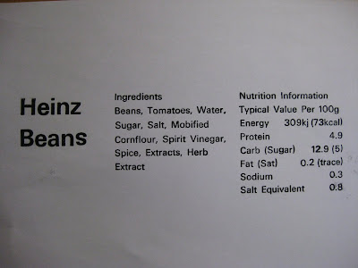
The technician at letterpress advised me to use font type Univers Medium as oppose to Arial because it was more neutral to the human eye. The ideal font size for Univers Medium for my product was 14/16 points but not all letters were available and so I was forced to choose between point size 12 or 18. If I was to go down to point size 12 then this creates enough space for me to move and play around with the composition but will take away the element of having large print font on labels. And so I chose point size 18 and thought I will have sacrifice any spacing or words if neccessary. Because of the nature of the point size the width of the label increased to 4cm more as the label was divided into sections of 3, each being 22 picas width long. Knowing that the label would be larger than antisipated I thought I would carry on and alter any neccessary changes later. I did also had to remove away the "(51%)" and "(33%)" seen in the ingredients to be able to have enough room. This was when I realised that I have to work with a limited and restricted area and will still need to play around with the composition a bit more. In the "Heinz Beanz" logo I has to replace the "z" with a "s" as I was limited to only one z, but I hope that by the time I print my final design the z will become available.

When it came to printing I'd realised that there were some letters which were up-side-down such as the "s" in "Beans" and the "n" in "Heinz" and the "d" in "Modified"- proof checking through printing is a very vital stage. After printing several copies onto newsprint and photocopy paper I took them away hoping that I can later cut up the words and reconstruct them in a better composition (since Univers font is not available on my computer nor is the font size).

I think the letterpress will be a main focus on the development because I'm able to get a clear print for the letters but my only worry is the font size and how this has changed a bit of my composition. I did thnk of having the letters pressed to create a surface but I wouldn't think this would make the reading clear for a visually impaired person as shadows will be formed distorting the sentence.

I also asked the technician whether braille could be created if I imprinted it onto the paper, but he advised it would be very difficult as you'll have to construct each full stop together and it will be a long process. He said that a person a few years back created braille using a back of a paint brush and poking into the paper; I have experimented with a pin to create braille and it formed perfectly well. I remember when I went to the MertonVision Centre there was an instrument to construct braille in a grid and perhaps I could try buy/reconstruct the instrument for labelling. If I was to do braille I would do it for the three titles of "Heinz Beanz", "Ingredients" and "Nutrition Information", as braille uses alot of space on the paper.


29/04/2010

Blind dinner


Dans Le Noir is a sensory culinary experience where you are served in pitch darkness. I was recommended to go and experience this restuarant however the meal was was out of my budget and thought that it would be best to try it at home. Telling the cooker of my house not to tell me whats on the menu up until the meal, I blinded folded myself and walked carefully to the dinner table. I knew where everything was having done this everyday but I felt I was more cautious to where I sat and where my cuttlery were. I asked for my soup to be poured being afraid I was to spill it and asked for food to be placed in my bowl before me. I then just continued eating but became more aware of the taste and recognising carefully which food was what. It was quite frightening to trust the person putting food in my bowl because I don't know whether I would like it or not. I personally do not enjoy eating prawns at all and one was placed in my bowl without me knowing and I immediately rejected it in my mouth because obviously my tongue did not recognise the taste. I couldn't focus on socialising around the table as much because I was more focused on imagining my whereabouts and where half my cuttlery was... especially my tissue! After the end of the meal I got up to get my fruit as I would normally do I selected an apple (usually I would opt for an orange but I imagined the difficulties of peeling an orange may be).

The whole blinded dinner experience allowed me to understand the difficulties of loosing your sight and how things could maybe be adapted. I could of requested my plate of food to be placed in a specific orderon a plate rather than a bowl, I could of have someone explain what was on the table rather than just eating and guessing. I also could of peeled the orange and making sure I use my hands to feel every bit of the orange that the skin has been removed. I think after this experience I might try and make breakfast, but not blind folded but with goggles that illustrate what some visually impaired people see through their eyesight.

28/04/2010

Whilst developing my product I have realised that collaborating with someone who is visually impaired may become useful and ideal as this could help me improve and fit the needs properly instead of me presuming what is right. I have asked for a contact from a friends friend who works in the Whitechapel Gallery. She said she knew someone who was visually impaired but they had left the gallery and advised me to contact Shape (http://www.shapearts.org.uk/) for more information.

Shape is a disability-led arts organisation who run projects and arts programmes for disabled people. The organisation encourage those who are disabled and deaf to take up and leisure or life long learning opportunity making it easier and accessible.

After calling up the organisation I am told my details are passed onto the organisers and will be contacted. I hope this opportunity is given to me as collaborating with someone to develop a product will not only make the project make sense but will also allow the partner to speak out what difficulties they come across and how they would like it to be resolved. I do understand however that there are different types of visual impairment and therefore the solution may need to be altered to suit each individual. Perhaps if I had more time on the project I could possibly select a variety of people and try create a general solution to cater for everyone.

27/04/2010

Sargy Mann

Sargy Mann is a blind painter who is based in Peckham. I'm not sure whetehr he studied at Camberwell but his daughter, Charlotte Mann, did. It was hard to find any information about Mann but here is a short documentary which explains briefly how Mann paints.


The description of how he visualises the orange cup amazes me and helps me understand what his eyes tells him. His style of painting gives the sense of "being there".
Mann's work is definitely about looking. With what started as short-sightedness and astigmatism has become cataract and ultimately led to a corneal transplant. Mann is totally blind since 2005. His brushwork is confident and furiously fast, his colours like music.


After watching this clip it will be important that I can make the audience visualise how some visually impaired people see by using a pair of goggles. I could also do a selection of different impairments to illustrate the variation. This will make the product interactable to everyone. Its quite fascinating how he doesnt use contrasting colours and can see the warm tones.
Focusing on the Heinz Beanz packaging I again experiment with the layout, stripping away anything I feel that is unneccessary to the human eye. I've selected for the logo, ingredients, nutrition information and the dietary advice to remain. I chose the dietary advice of "Suitable for gluten free diet. Suitable for Vegetarians. A low GI food. No artificial colours, flavours and preservatives" because I thought how important this information can be for someone who has multiple health conditions and need to be aware what is good for them to eat.


After reading some printing advice for partially sighted viewers (http://www.bristol.ac.uk/is/info/disabledusers/infoaccessible.html) I begin to consider when to use capital letters what font tp use and how big. The advice given was to use clear fonts such as Arial, Serif or Verdana and print size to be between 14-22. Below shows the different font types of the same label, Verdana and Arial respectively. Looking at the Verdana font, the text is wider, the spacing is too and the font seems flatten horizontally. However the Arial font seems more clearer and doesn't use alot of space in the paragraphs. This could mean that more text can be included and the spacing and width of the letters are not too far apart to create difficulties for the viewer to read. With this I have continued using Arial for the rest of my experiements but am opened to other fonts that may become available.


25/04/2010

Using the first product with a label that was available at hand to me, I can see that half of the wirtten contents of the Coca-Cola bottle can be taken away leaving with:

1) Branding logo
2) Ingredients
3) Nutrition Information

This will then allow me to have room to enlarge the font and play around with it. I had shorten "Ingredients" to "ING" and want to play around with short hand language; this could help to create more room within the restriced label but I fear that it may not be advisable because some people may find short hand language to understand. If I was to stay true to the product then this short hand would create a disadvantage but if the product was more contextual then maybe I do not have to feel so restricted. However the difficulties was that the ingredients took over half of the labels making no room the nutrition information. I then thought of taking away the ING and replaced it with a simple bold line top and bottom, framing the text. After playing around with the text I printed the ingredients text out because this would give me a real draft of how much space I would be able to play around with if the product was to be printed. This create reduced the text space and allowed the nutrition information to be squeezed in gently.


After playing and experiementing the different layouts that I could do for the Coca-Cola label, I reached a conclusion that this type of bottle restricts me too much to be my initial design for the project. Perhaps if I was to develope this last when I have gained a bit more experience of the labelling structure of what goes well and what doesn't. But for now I will have to leave this design and focus on something else that has a larger surface area. Perhaps I could focus on a coke can soon- that will be about 90% of the packaging available to experiement with.