Foundation Graphics Final Major Project

07/05/2010

Reversible label idea?


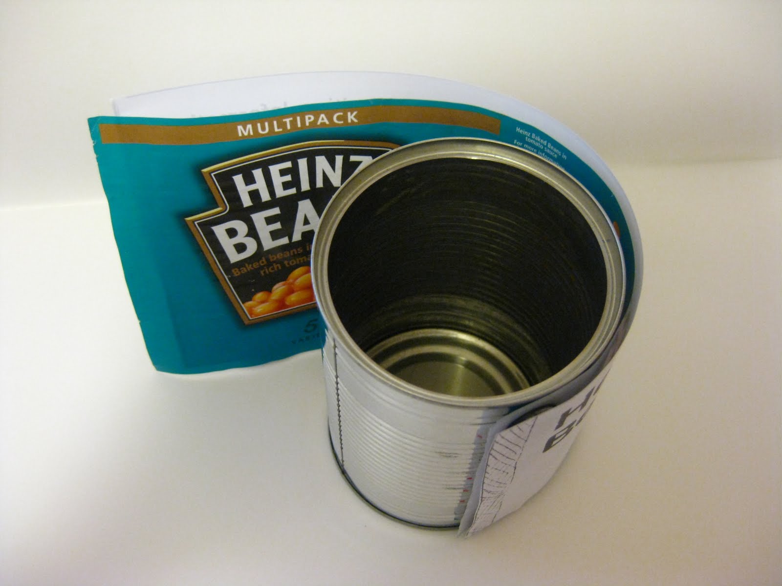
Testing out with the reversible label idea I first used the velcro to secure in place. This was good tool because when I reverse the label the velcro it is still hidden away... however the label becomes bulky and it actually makes me feel like I am dressing the tin can like a Barbie doll. It is more prone to wear and tear though seeing the nature of the removal of the label.

I next thought of the idea of using magnets to try and secure it in place, but this did not work as well as the velcro method did because when it was reversed, the positive vs. negative side of the magnets would oppose each other and it didn't work well. Plus I could imagine the magnets sticking to other tin cans which wouldn't be helpful at all.

I've started thinking about how I am going to print the background colour onto the label as I do want a smooth finishing touch to avoid the confusion of texture if I was to put braille on. I have experimented with rolling the colour on but this created a slight testure after the roller... I then tried another type of roller and this result came out slightly better but it still had texture. Also it left a matt texture which I'm not too keen about because it makes the product quite dull and not vibrant. It may be because of the colours I am using to test out because they are quite pastel based... which I am determined to brighten up. Finally I watered down some acrylic and used a brush to paint it on which came out a much smoother texture then the other two however the strokes of the brush came be seen... this may be resolved by using a bigger brush. I can imagine the strokes still being seen and will still not achieve the smooth texture that is desired. I feel looking back at my test pieces just made I need to think of what type of paper to use, colour, medium to paint it with and whether to reuse the label and make it reversible- I am going to discard the idea of reversing the label because I feel it brings no use to the product and project. Also the technique of making it reversible (i.e. using velcro or magnets) will remove sense of the product being a tinned can of food. The removal of the label is already difficult as I am constantly tearing the ends therefore making the attachment of the velcro/magnets impossible almost.

05/05/2010

With the thought of what material I can print the labels onto- whether it be paper, newsprint, glossy paper etc... I really wanted to keep the same texture of what is already on tinned cans. After observing the can and removing the label, I thought of the idea of reusing the label as it is already available to me. If the label is reversible, both visual and visually impaired people are able to read as desired. It will also maintain a recycling scheme which is an ongoing problem for the packaging industry and so the information (such as the company's details,storage information etc) is still preserved and readily available. I can screen print the colour onto the label and then later letterpress the information. However the main problem for me is the careful removal of the label as the label is securely glued onto the tin. As I remove the label with my scalpel knife I am left with ridges and tears that doesn't seem visually presentatable when put back together. Also because of how the label is removed I also remove the bleed of the label where the label is to be stuck together, therefore decreasing the length and area. I proposed to add on more paper to the end for it to wrap better, but then I came across with the problem of what to stick it on with since the label will need to be reversible. Could I use reusable glue, sticker or something else possible?

After still struggling to remove the label carefully I thought of the idea of using velcro as an option... this is reusable and wont wear or tear. Although I can imagine the velcro creating a raised surface and taking away the flat label that wraps arounds the can. I will need to play around with this idea once I know how the label will look so i know where to put it and how.

Also I will need to be able to create a 'system' so that every canned tin can be distinguished easily from each other. As my project has progressed I did think I would only need to develop 4-5 working different products such as milk, cornflakes, bread and fruit possibly. But in the supermarket there are many varieties available to every customer that picking one particular may be difficult to a visual impaired person; how can one differentiate a can of baked beans from a can of spaghetti hoops more easily? I have thought of an idea to paint the bottom (and maybe the top) of the can to the colour of the font colour already printed with- this will contrast against the main background colour. I am quite hesistant to colour the top because then I feel like it becomes too busy and too colourful... but maybe painting the pulling ring?

Other ideas could be to use the covers for cans that are already available... this can be colour co-ordinated