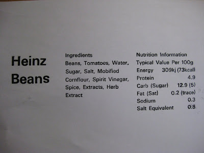
When it came to printing I'd realised that there were some letters which were up-side-down such as the "s" in "Beans" and the "n" in "Heinz" and the "d" in "Modified"- proof checking through printing is a very vital stage. After printing several copies onto newsprint and photocopy paper I took them away hoping that I can later cut up the words and reconstruct them in a better composition (since Univers font is not available on my computer nor is the font size).
I think the letterpress will be a main focus on the development because I'm able to get a clear print for the letters but my only worry is the font size and how this has changed a bit of my composition. I did thnk of having the letters pressed to create a surface but I wouldn't think this would make the reading clear for a visually impaired person as shadows will be formed distorting the sentence.
I also asked the technician whether braille could be created if I imprinted it onto the paper, but he advised it would be very difficult as you'll have to construct each full stop together and it will be a long process. He said that a person a few years back created braille using a back of a paint brush and poking into the paper; I have experimented with a pin to create braille and it formed perfectly well. I remember when I went to the MertonVision Centre there was an instrument to construct braille in a grid and perhaps I could try buy/reconstruct the instrument for labelling. If I was to do braille I would do it for the three titles of "Heinz Beanz", "Ingredients" and "Nutrition Information", as braille uses alot of space on the paper.
